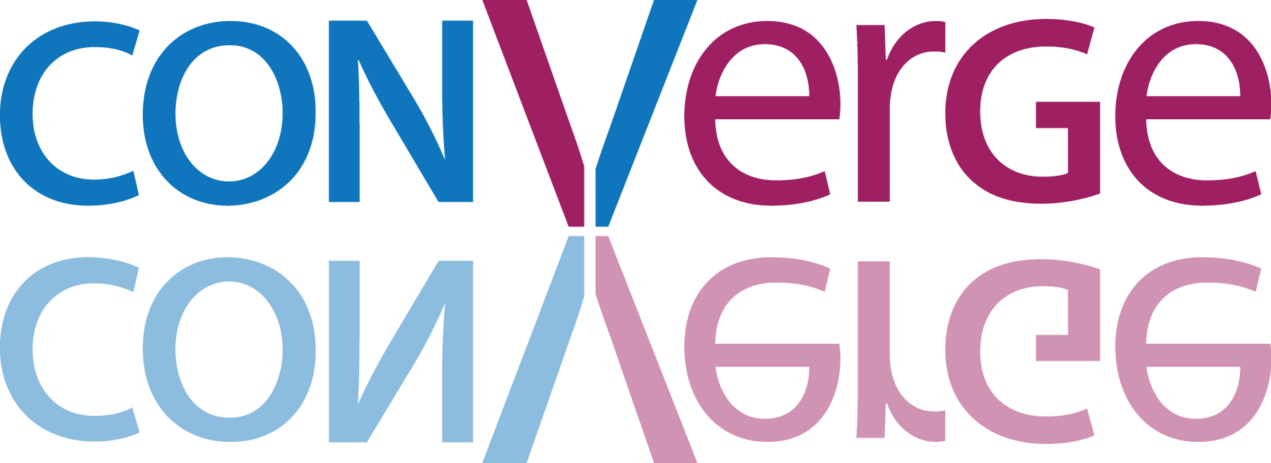
"Above are three examples of our current logo. We all think it’s decent as it stands, but would love to see if there are a few tweaks or changes you can make to make it even better.
Per our conversation on the phone here a few things I know we want in the logo:
- Simple and clean, not really busy
- Target audience would be a senior in high school
- No “churchy” elements
- Easily transferable for branding (t-shirts, rubber bracelets, cups etc.)
Comments
Justin Bernard on July 16, 2014:
"Above are three examples of our current logo. We all think it’s decent as it stands, but would love to see if there are a few tweaks or changes you can make to make it even better.
Per our conversation on the phone here a few things I know we want in the logo:
- Simple and clean, not really busy
- Target audience would be a senior in high school
- No “churchy” elements
- Easily transferable for branding (t-shirts, rubber bracelets, cups etc.)
Justin Bernard on July 16, 2014:
https://www.google.com/search?q=logo+converge&espv=2&tbm=isch&tbo=u&source=univ&sa=X&ei=Zv_FU66SNenLsASmioDQDA&ved=0CBwQsAQ&biw=1436&bih=806
Taylor Bernard on July 16, 2014: